MyVrends App Design & Development
A social life app that aims to help students host events, activities or clubs to meet new friends with same interests.
Pain Points: Newly enrolled international students have few resources to help themselves settle down in local community and feel at home.
Challenges: How to promote the app among students? What benefits can they get?
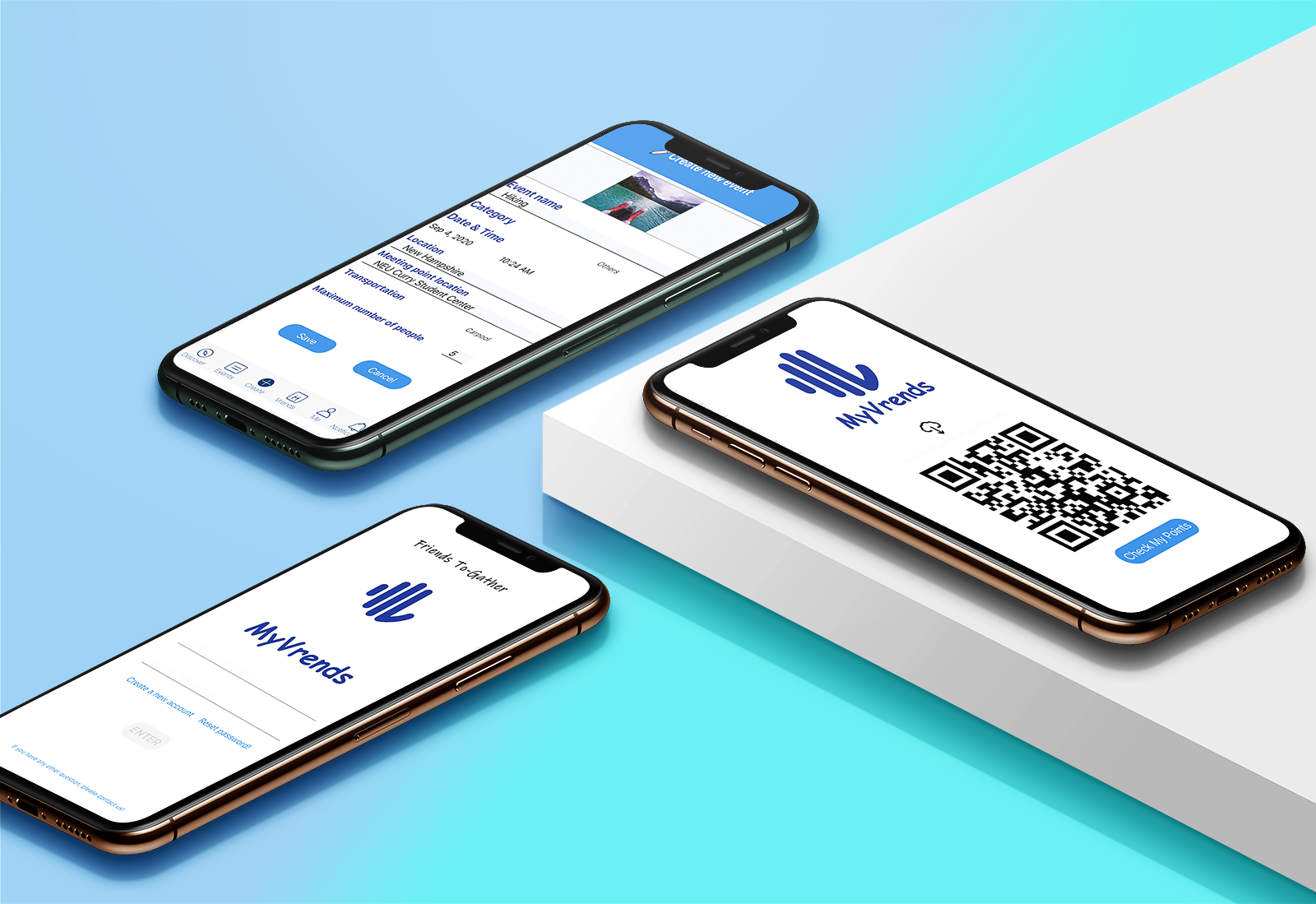
Solutions: Add event function to let users create activities or clubs and invite friends to join; Provide carpool, membership sharing and coupon referral options to bring convenience to new students; With a unique QR code, users can refer friends to scan and install the app directly to get referral points.
My Tasks: I drafted the conceptual map based on user research, turned user insights into user flow and lo-fi wireframes. I designed the logo, icons and hi-fi mockups. I also joined the development team to test and deploy the app over the 3rd party platform and launched it on App Store and Google Play.
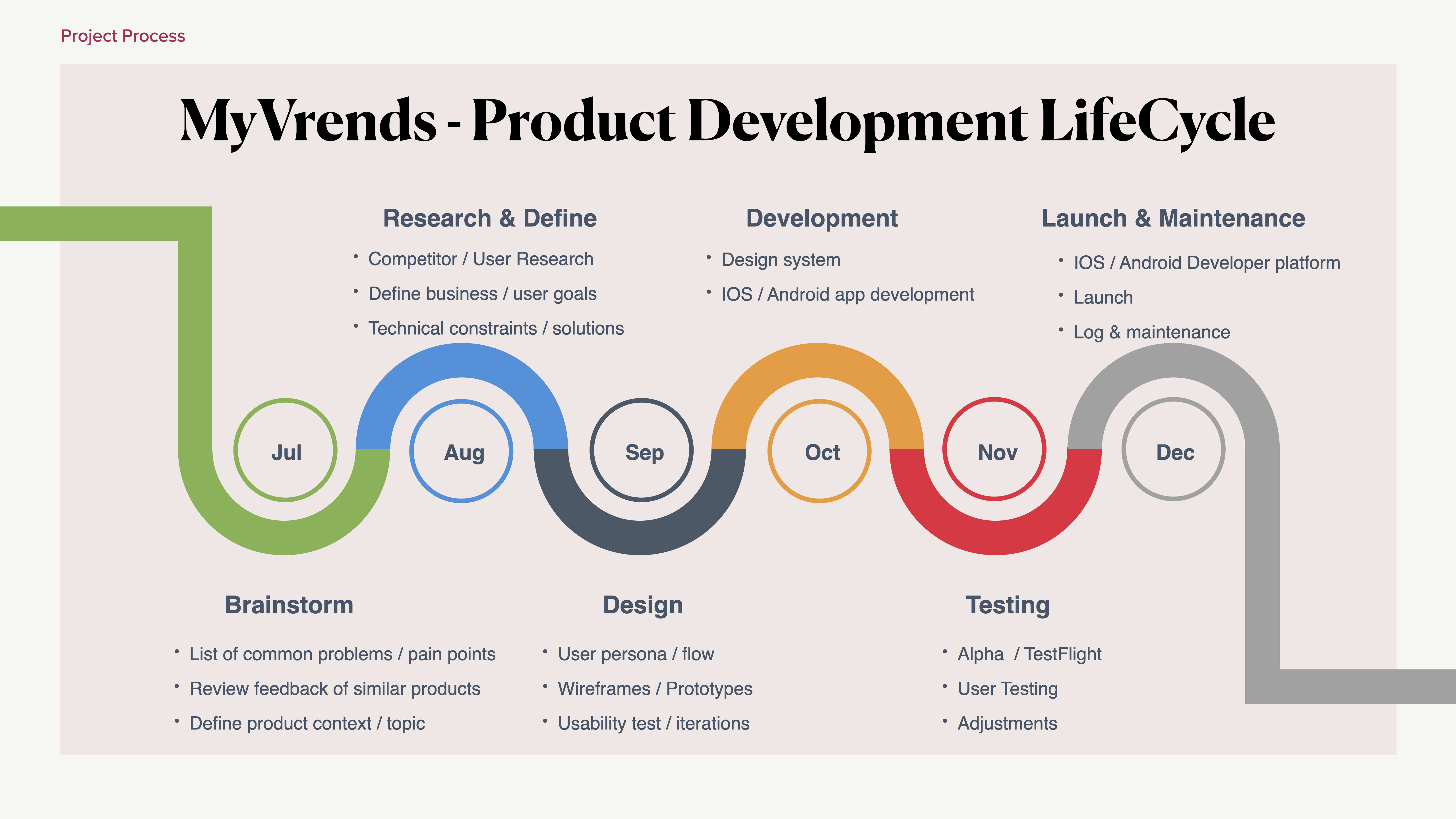
PDLC Process
UI Design
Duration: 6 months
Methods: Interviews, Card Sort, Usability Testing, Wireframes, Prototyping, IOS/Android App Development
Tools: Optimal Workshop, Figma, InVision, Adobe Photoshop, Firebase, Apple Developer, Thunkable, VS Code
View Prototype with FigmaIOS Download
Android Download
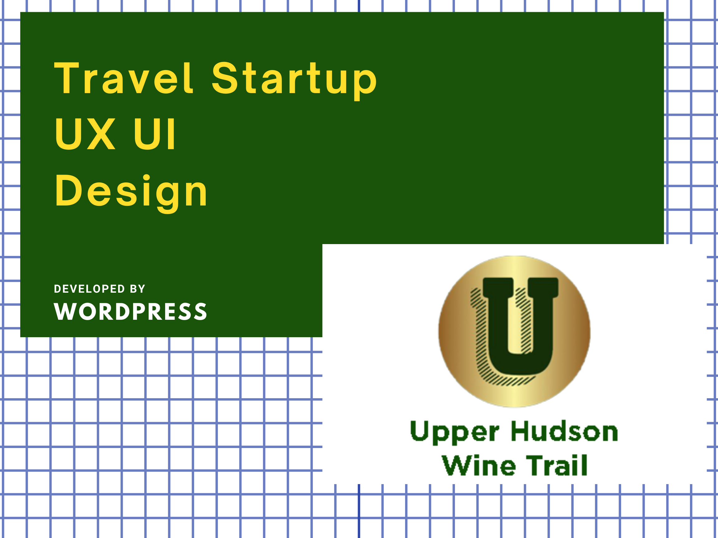
Upper Hudson Wine Trail Website Design
An amazing New England getaway place for family gathering, team building and wine tasting in the post-pandemic.
Pain Points: Users couldn’t find a lot of points of interest form the website; Some know little about the grape and wine differences. Locations is distant from downtown.
Challenges: Current website is with incomplete context and cluttered layout. News is piece by piece. No consistent design system.
Solutions: Highlight its market value. Use CMS to keep content consistent and well-organized. Provide customized itineraries and FAQs. Collaborate with other wineries / diners to provide daily tour activity.
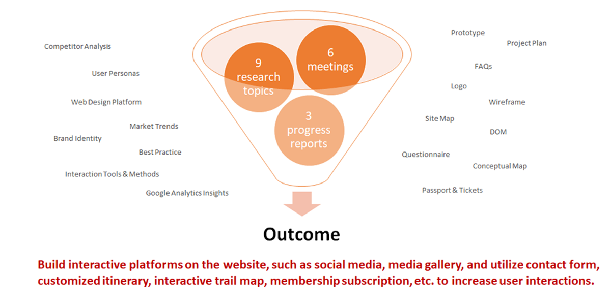
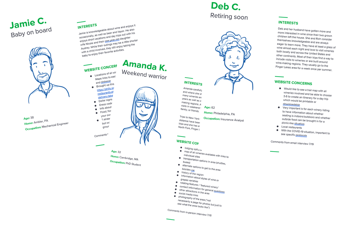
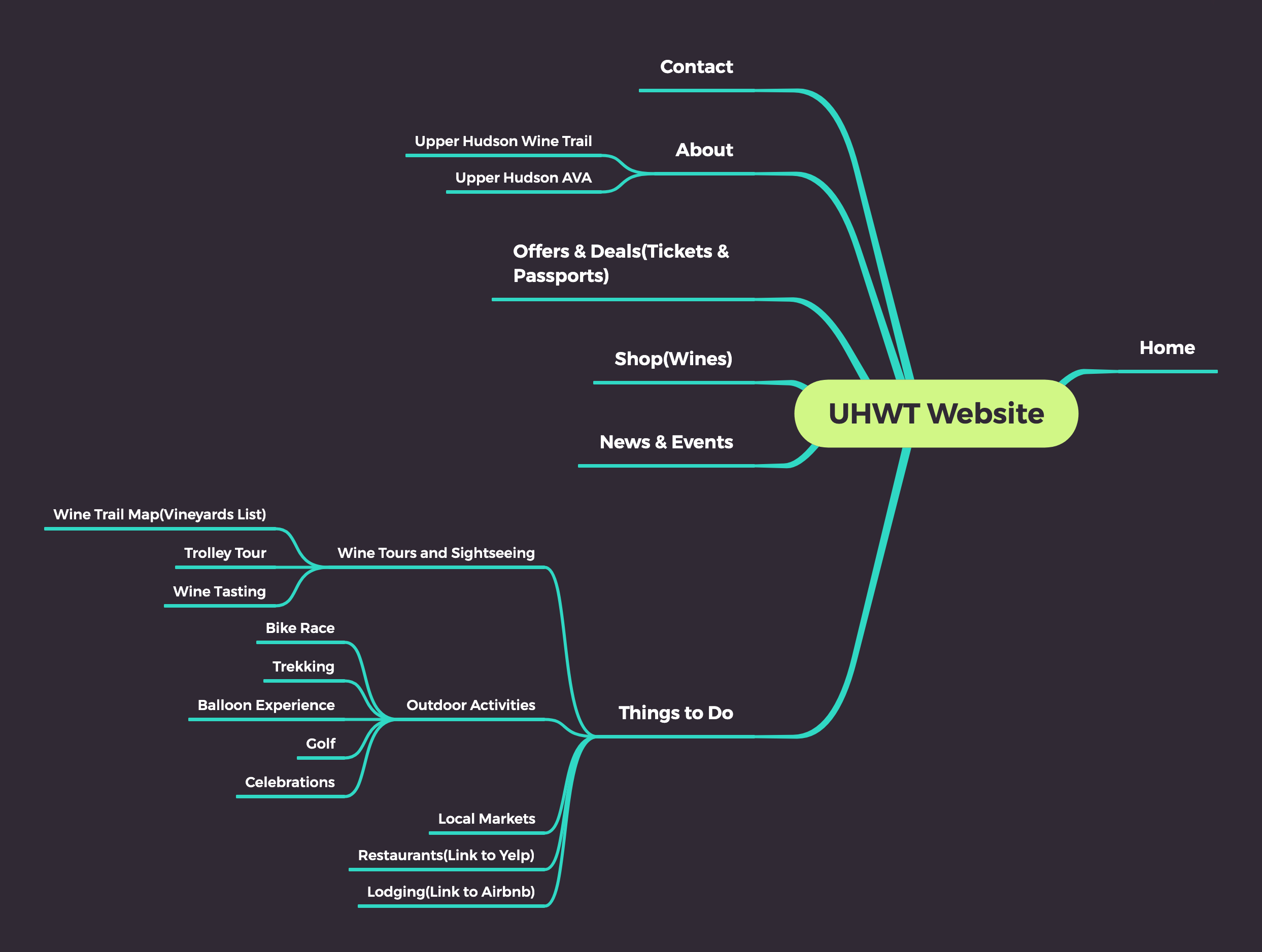
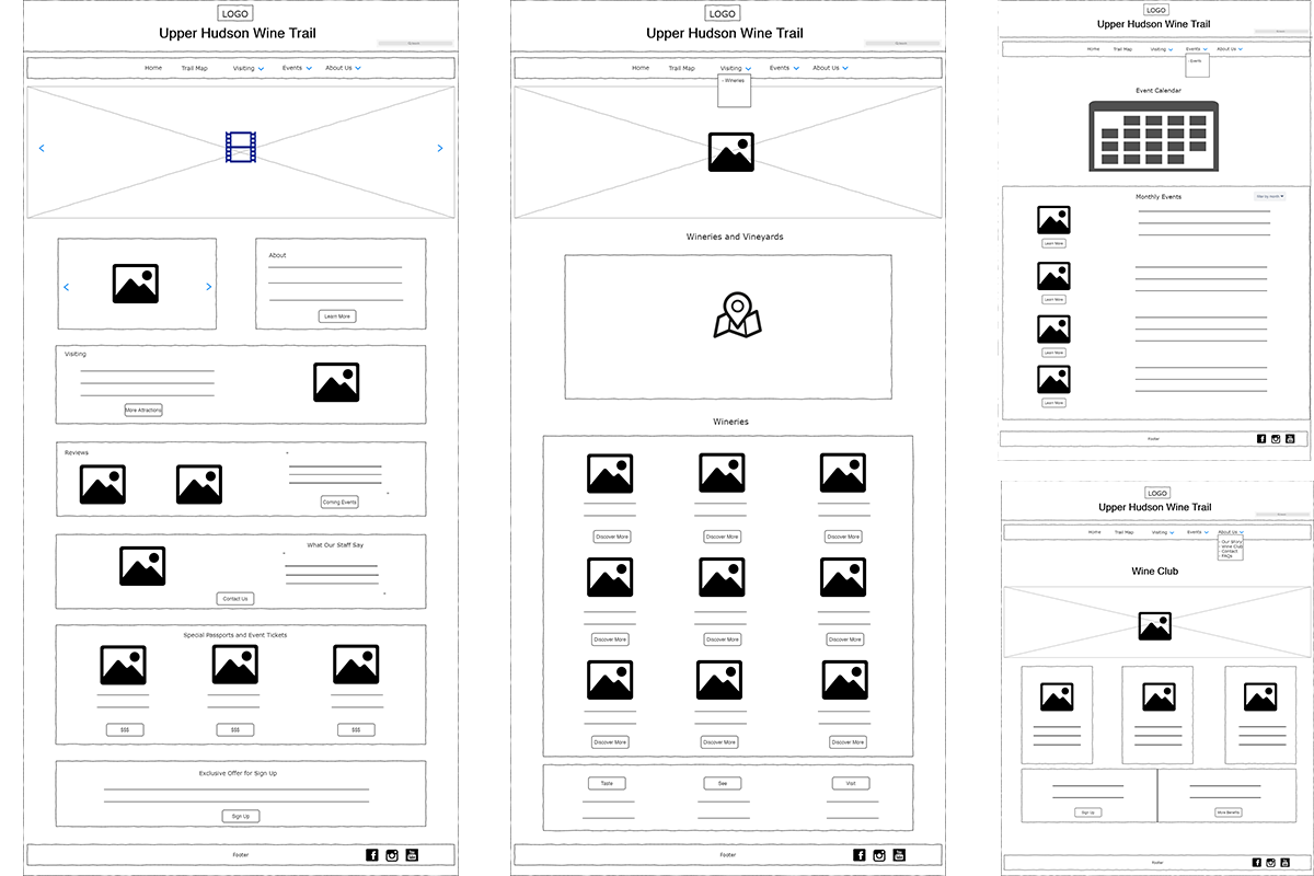
My Tasks: Worked as a team leader to coordinate the user interviews and manage project timeline. To optimized user interactions, I designed the survey questionnaires to better understand use behaviors. I used WordPress CMS to reorganize the content and based on the conceptual map, I redesigned the layout, introduced Google Map API for users to customized their tour route. I also designed the coupons and posters to give a fresh and consistent feel about the brand.
Project Process
Research
User Personas
Information Architecture
Wireframes
Learning & Rethink
- Listen to the users first, understand what they expect from the product and tap into the data with goal-oriented outcomes, and then follow the best practice to design the interactive product.
- A good interactive website design should improve the business strategy and increase business value for a company.
- Collect diverse data can help a business to realize more about its targeting audiences because it improves the business according to its result of data analytics.
Duration: 3 months
Methods: Brand Analysis, Competative Analysis, User Personas, Wireframes, Prototyping
Tools: Google Analytics, Figma, InVision, Slack, WordPress
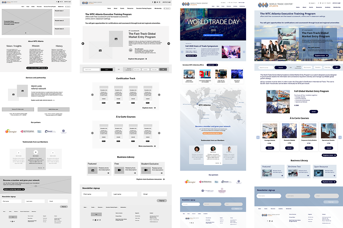
View on WordPressWorld Trade Center Atlanta Website Design
As an international business community, it is about to launch new Academy page to its official website.
Overview: To make the WTC Atlanta website a more contemporary international business community, my project aims to design a prototype focusing on the Home and Academy page, which provides a platform for members and partners to explore and share business resources and learn and develop business skills.
Pain Points: Company was losing web traffic. Users found it difficult to navigate to specific content. Content wasn’t attractive and interactive enough to keep users stay on the page.
Solutions: Focus on the Home and Academy page to provide a platform for members and partners to explore and share business resources and learn and develop business skills.
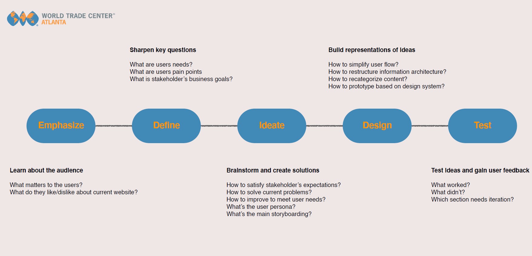
My Tasks: I worked as a team leader to organize and conduct the user interviews, keep communicating with both stakeholders and users, and track the project timeline. We've collected user's pain points through the interviews, created personas, and translated their insights into storyboards and scenarios for further wireframes and prototyping. With iterations based on user testings, we came out with a high-fidelity mockup of the website which met both business and user's goals.
Design Process
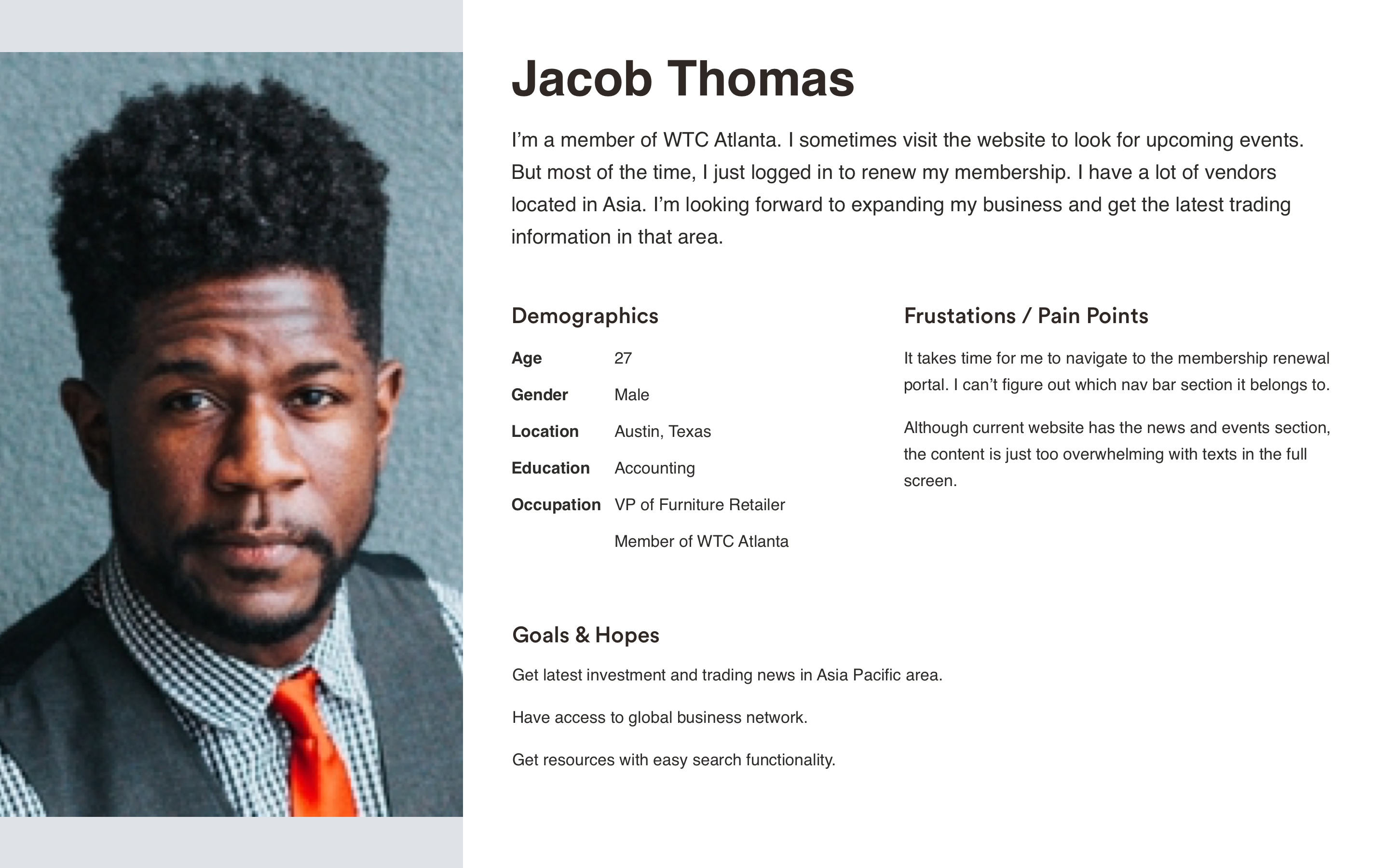
User Persona
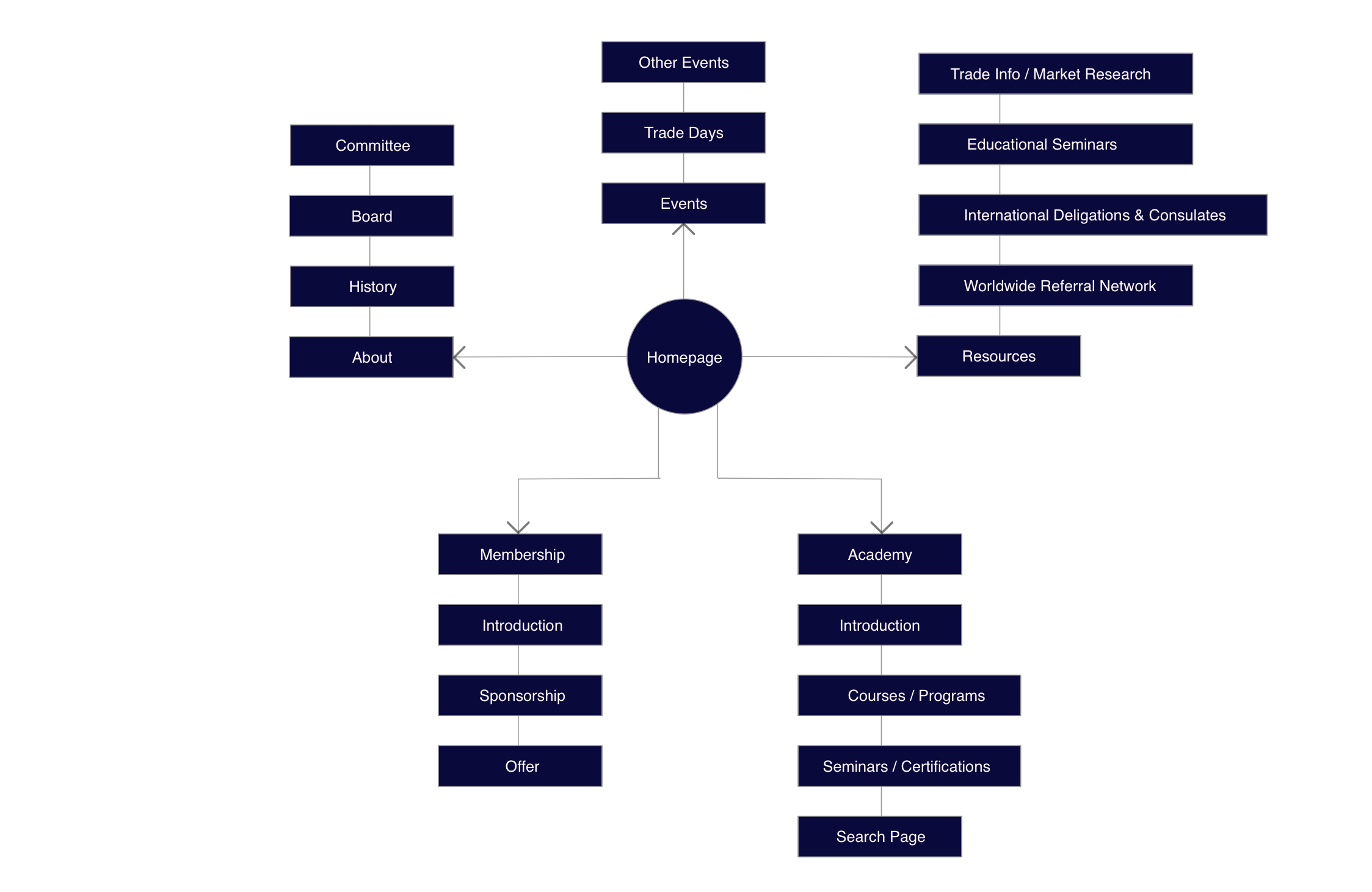
Information Architecture
Wireframes & Prototypes
Learning
- Less is more: Interfaces need to be cleared and organized. Avoid cluttered content and layout.
- Match between system and the real world: Use words, icons, and concepts familiar to the users that can help to build an intuitive user experience.
- Prioritize certain features or content: Users consider recent news, updates, resources are the most significant content on the home page.
- Credibility is a plus: Endorsements from well-known academic institutions or organization can make courses more trustworthy and persuasive.
- Diversity and cross-region: Content such as map, news, testimonials can be more cross-culture and worldwide.

Duration: 3 months
Methods: Card Sort, Interviews, Comparative Analysis, Usability Tests, Wireframes, Prototyping
Tools: Adobe XD, Sketch, Optimal Workshop, UserTesting
View Prototype with XD
Northshore Florist App Design
A modern website design that brings the local florist store to e-commerce mode, which helps improve conversion rate for business to attract more Gen Y and Gen Z users.
Overview: Northshore Florist is a local flowers and plants store. Now it’s expanding its business scope to online business. The typical user is between 25-45 years old and most are college students or office employees. The site is designed to make shopping and delivery fast and convenient for all types of users. It allows users to shop seasonal flowers and plants, and provides users with useful care guidance.
Target User: Busy shoppers of all genders and backgrounds who want to have a fast, convenient experience purchasing flowers and plants from Northshore Florist.
Research Conducted and Research Findings: We conducted user research and received feedback from users that we incorporated into user personas. For example, our user persona, James, is a 29-year old full-time employee who shops online to send fresh flowers to his girlfriend on some holidays. The research revealed that James was frustrated by cluttered navigation and complex categories that made shopping confusing. James would like to see improvements like different filter and sort options. He would also like to see more options that suggest seasonal species or limited pieces.
Problems: Currently, the site has a cluttered layout and that makes the page too long, and isn’t very engaging with the blog content.
Insights Learned: From user research, we learned that there were some pain points for users. One of the biggest is that the categories for the products are a bit confused to users. Instead of figuring out what the flower species the flowers belong, users are more inclined to use the search bar instead. So we just modified the categories into two main sections. And besides the species, users can also filter by the color of the flowers. This covered most user’s searching preferences.
UI Ideation: Sketches and Wireframes: Here’s how we put our users’ needs first. The process below begins with our initial ideas wireframes, then moves to mockups, and finally to the high-fidelity prototype.
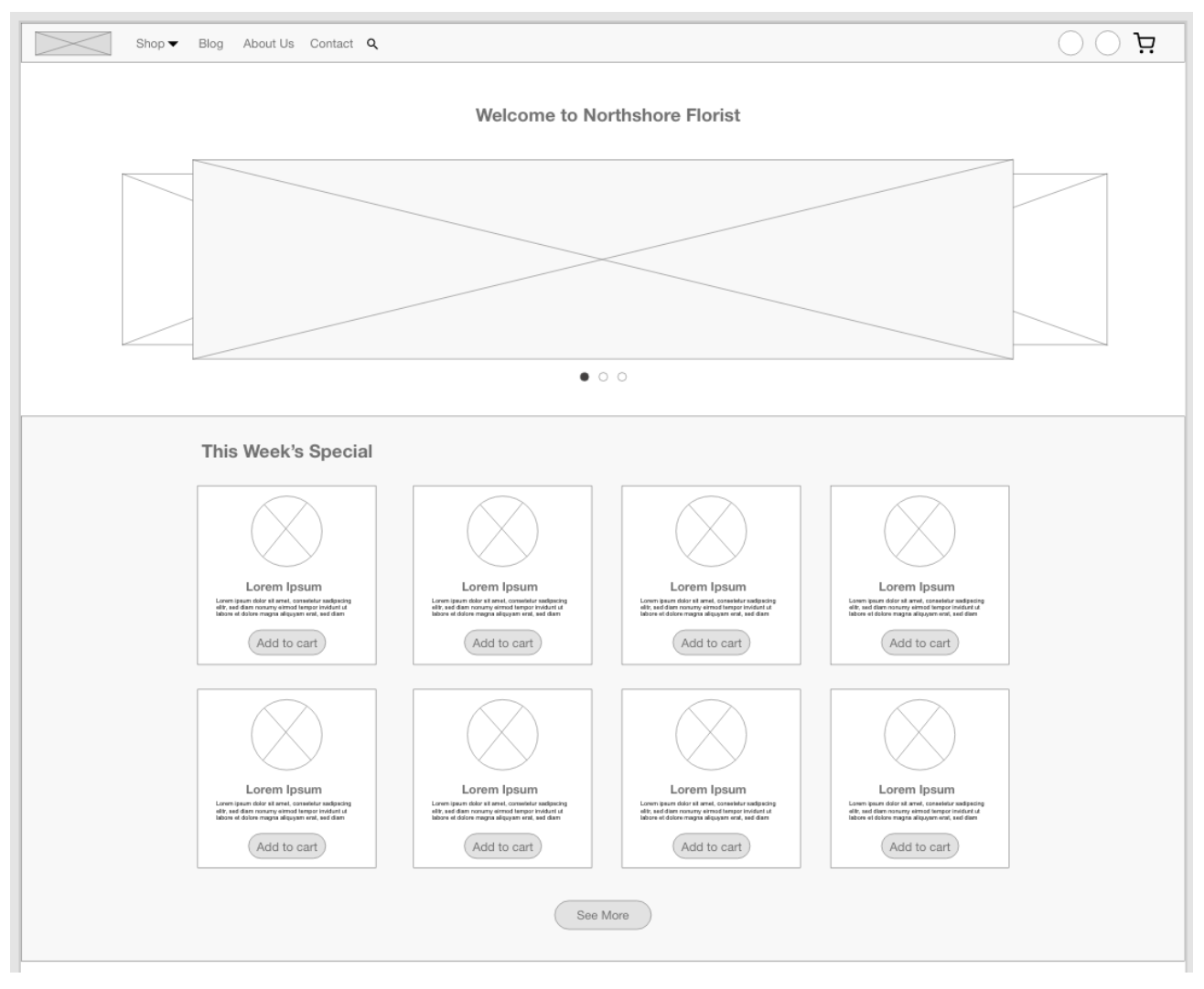
Wireframes
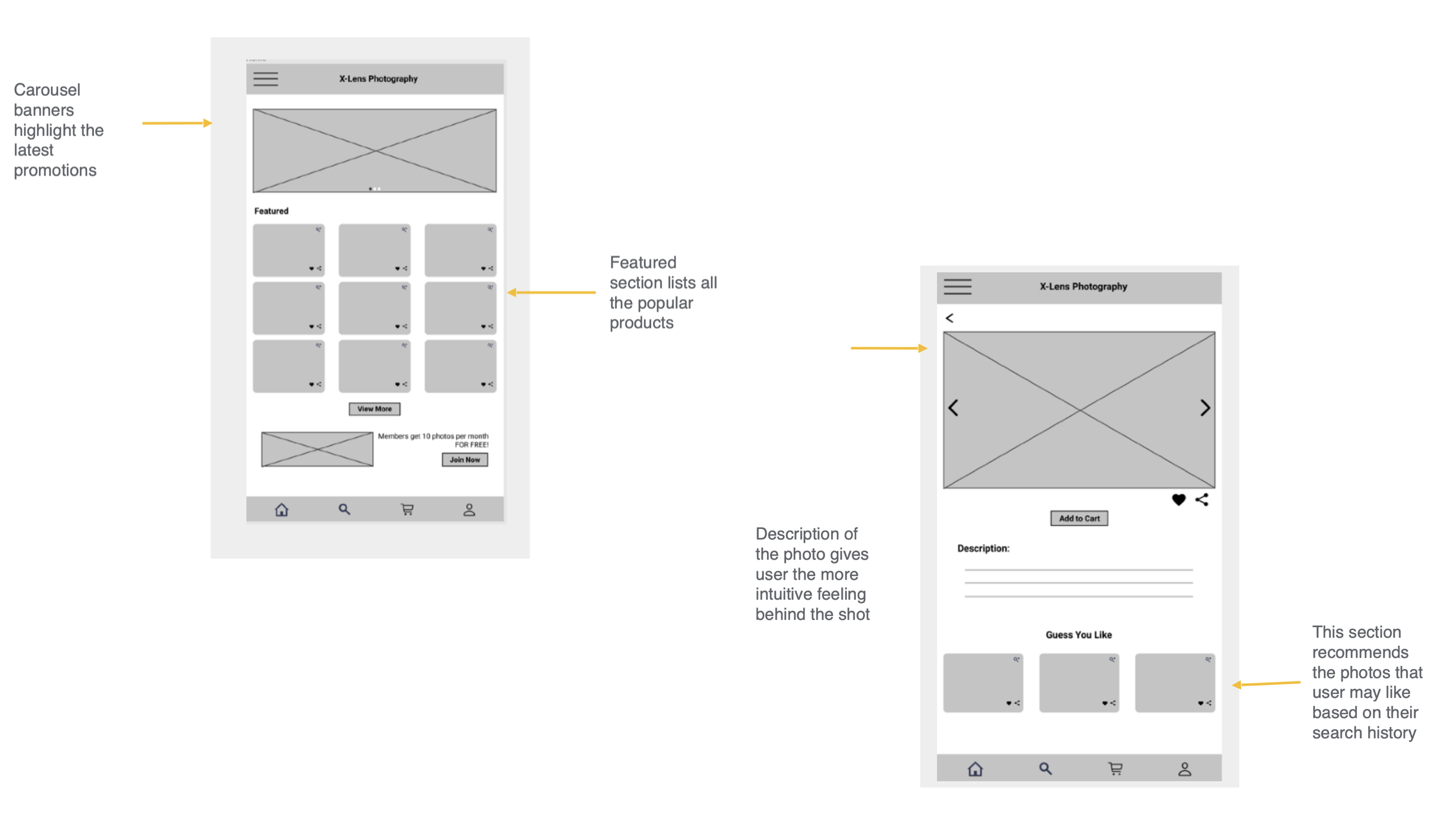
In this simple version, you can see how the designer approaches solving the user’s needs. The navigation bar is simple and the carousel banners list the store’s trending promotions and events. The week’s special section highlights the featured flowers and plants. Users can also click the See More button to view and shop all the products.
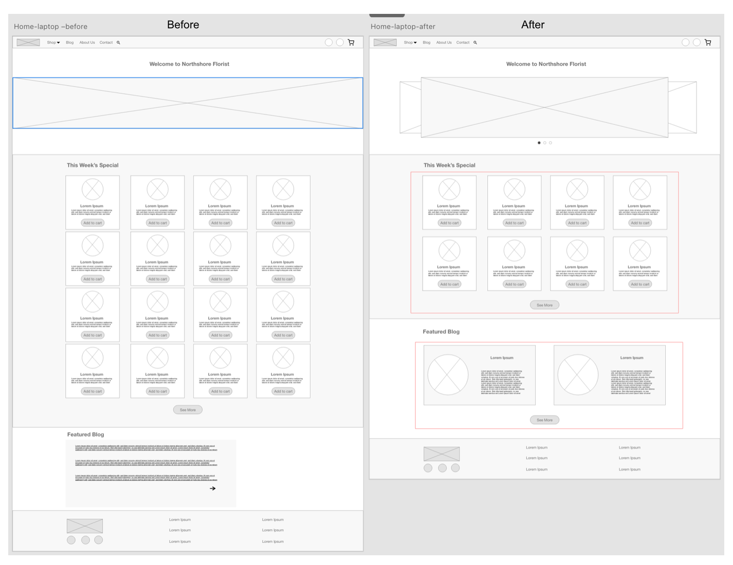
Revised wireframes after low-fidelity prototype usability testing: In the revised version, you see the progression of the design based on insights identified from usability test feedback. Design additions include simplifying the layout of this week’s special products and redesigning the blog section to use images and texts instead of a short paragraph, which will provide users more interactions.
Mockup
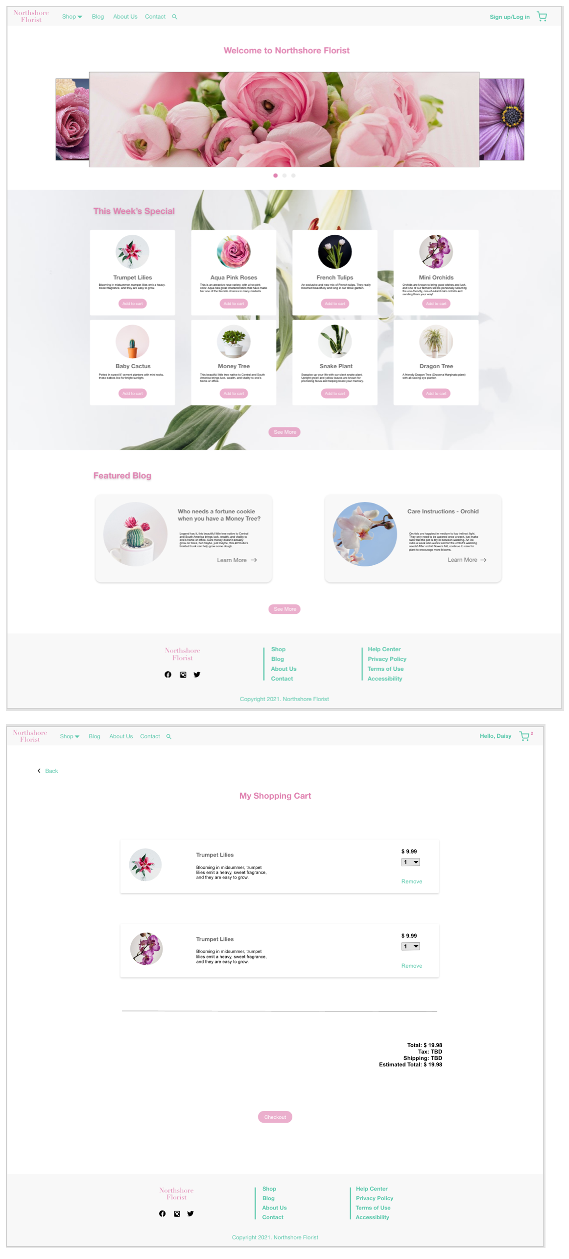
High-Fidelity Prototype
The design is fully developed and gives a complete picture of the completed design. It addresses the user’s needs for a simple, yet engaging and uncluttered design.
View in XDTakeaways
- Listen to the users first, understand what they expect from the product and tap into the data with goal-oriented outcomes, and then follow the best practice to design the interactive product.
- A good interactive website design should improve the business strategy and increase business value for a company.
- Collect diverse data can help a business to realize more about its targeting audiences because it improves the business according to its result of data analytics.
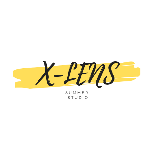
X-Lens App Design
X-lens studio is a local photography studio that helps photographer sell their photos. It strives to boost the business with new e-commerce model. It targets customers who like photography all over the country.
Project duration: April 2021 to June 2021
The problem: During the pandemic lockdown, the studio were closed and losing customers.
The goal: Design an app that allows customers to view all the photos and buy directly instead of visiting the store.
My role: UX designer from conception to delivery
Responsibilities: User interviews, user research, wireframes, prototyping, usability test
User Research
I conducted the user interviews to get user needs about using the app and created user journey map to understand user behaviors. I created user personas to define the primary user group and user goals. I also did the user research to define the business goals and integrate with the user needs to sketch the low-fidelity wireframes. Based on the usability testings, I iterated the user flows and UI patterns and polished with the high-fidelity mockups.
Pain Points:
Regulations - Local stores were locked down following the state’s regulations and people couldn’t visit the store in person.
Space - The space of the studio is limited that it can’t display all the works.
Format - Sometimes, customers only want the digital version of the photos instead of the printing version.
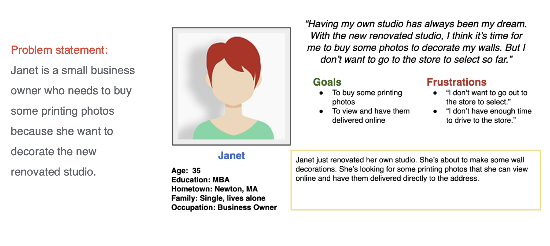
User Persona
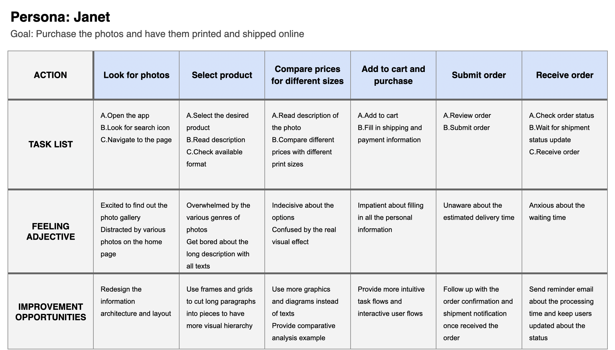
User Journey Map
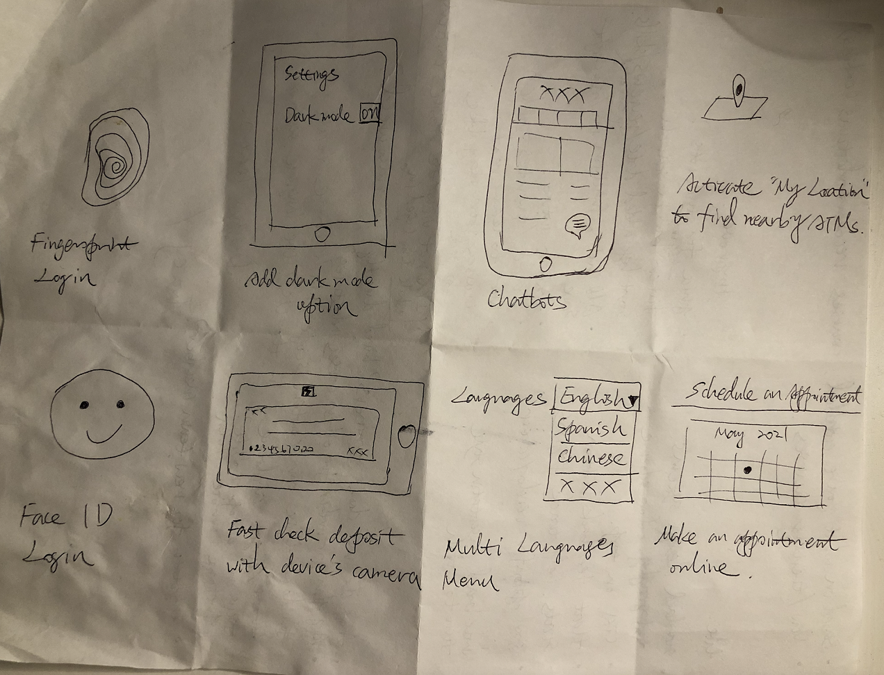
Crazy Eights
Based on the user journey map, I sketched the wireframes which follows the basic user flows and addresses the user needs.
Low-Fidelity Wireframes
As for the home page, I made sure to provide the primary user needs based on the user research. I added Guess You Like section to help business get more potential buying based on user’s preferences.
Usability Study
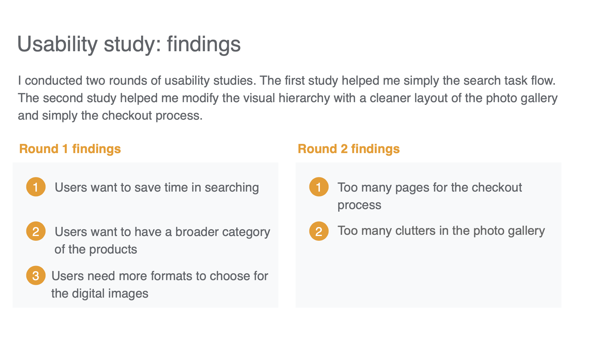
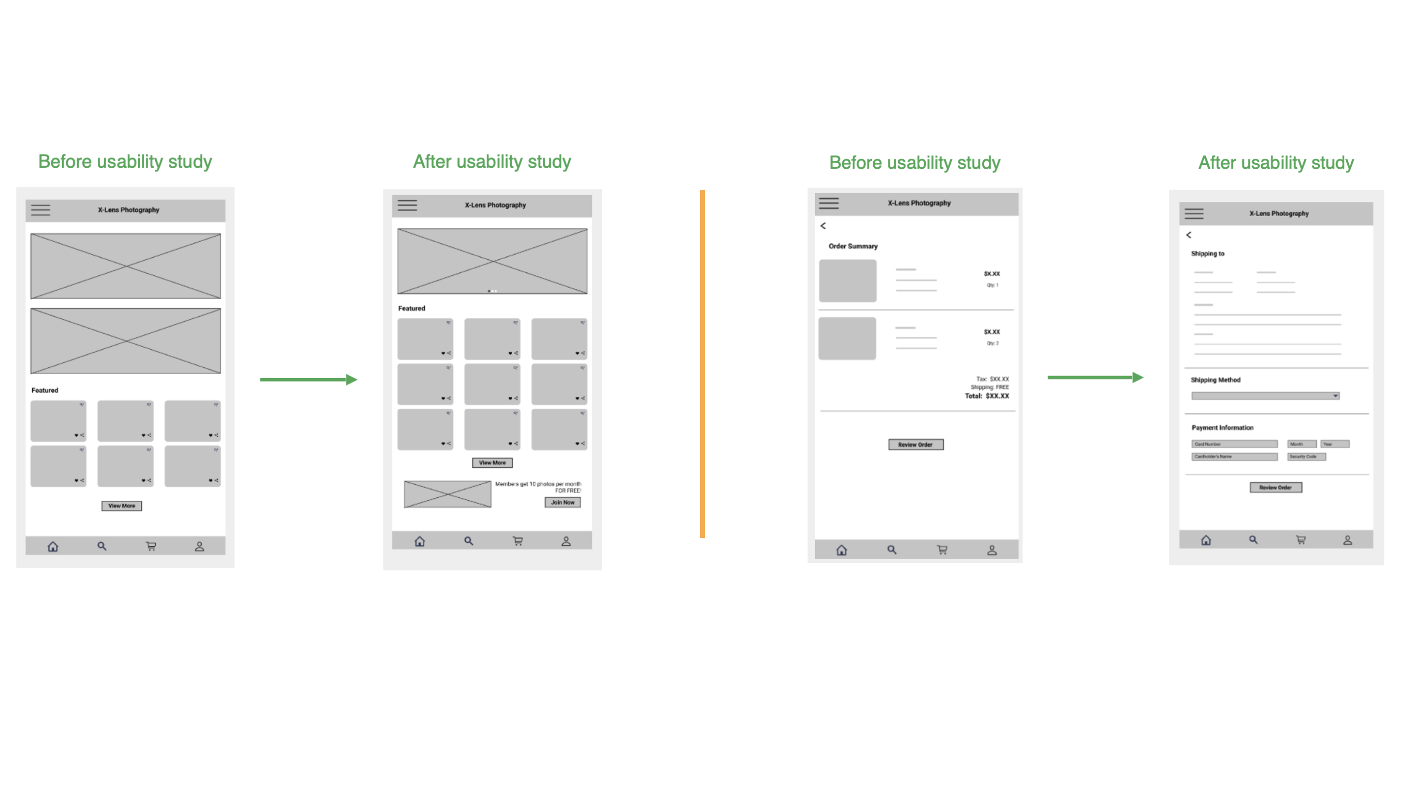
For the first usability study, I found that the banners weighed too much of the whole page. So I integrated them with a slideshow and add one more row for the featured photos. I also add a CTA button for the member enrollment.
For the second usability study, I noticed that I made every single checkout step with one page. This made users impatient. So I integrated the shipping info, method and payment info together with one page to simply the process.
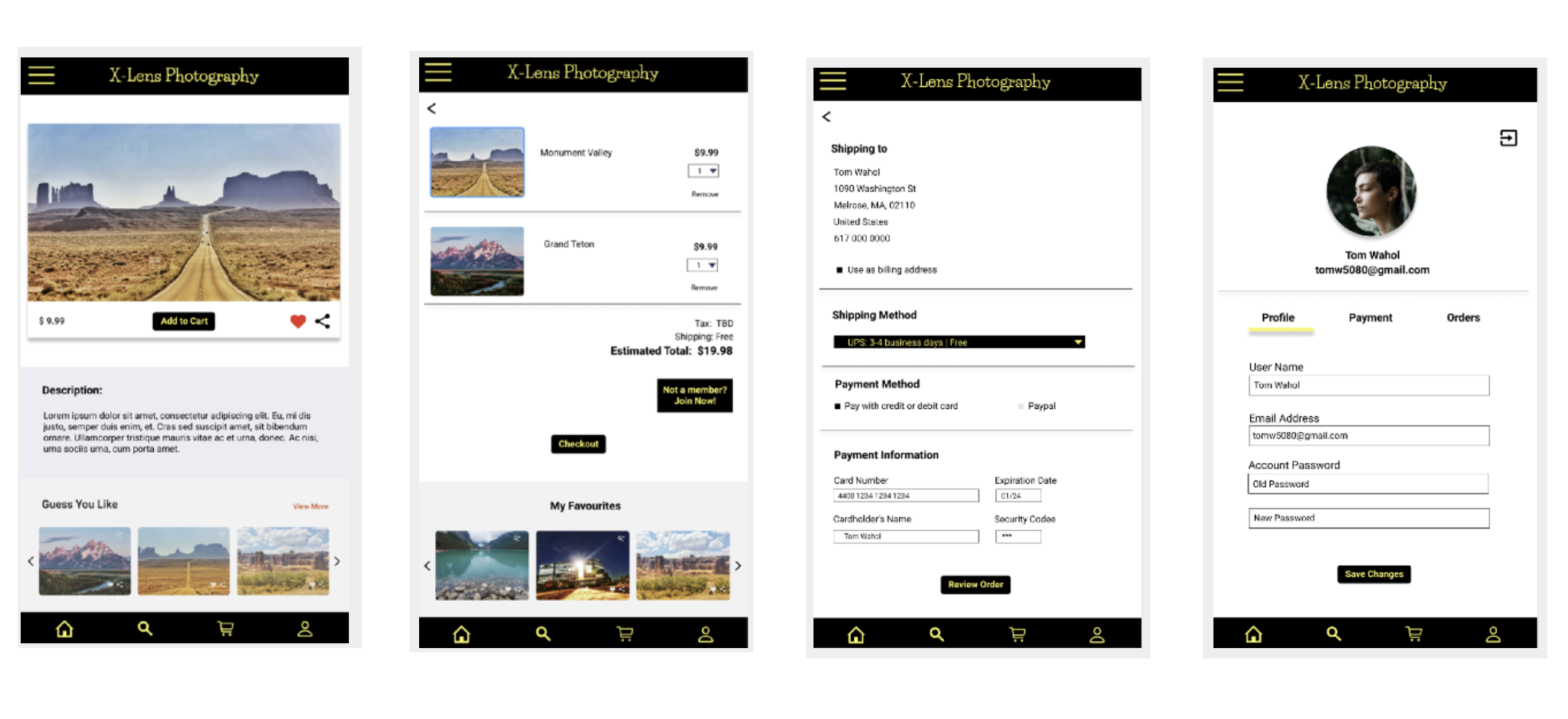
High-Fidelity Prototypes
View in Figma
Accessibility Considerations
- Add image alt and descriptions
- Use high contrast and lines to differentiate different sections
Takeaways
Impact:
The app brings the same experience for users to view the photo gallery and pick up whatever they like. With more convenience, users can easily make an order at anytime, anywhere.
I can just stay at home and view all the magnificent photos. I can even know which formats it provides for the digital versions. --Mike
What I learned:
User interview helps me better emphasize user’s needs and pain points. User research gets me more background to understand business needs. Usability study helps me dive deep in the functionality of the app.
Next Steps:
- Conduct another usability study to collect more feedbacks about the functionality of the app.
- Do some competitor research to explore more features for the app.
UBoostUs App Design & Development
A mobile coupon app that connects users with their friends by sharing coupons via QR code and getting boost points.
Business Goals: Provide platform for local stores to promote deals to customers; Encourage users to invite their friends to register to get boost points.
User Needs: Find local hot deals; Redeem coupon with boost points that they collected via inviting friends.
My Tasks: Before the sketch, I did competitive research and user persona to define the target audience, context and functionalities for this app. I also worked with marketing team to analyze and draft the user flows based on the research result and scenarios. I used Sketch and InVision for the wireframes and final mockups, and Photoshop and Illustrator for color palette and icon designs. Working as an agile team, we've gained team work spirits to push the project move forward effectively and smoothly via Jira. In phase II of the project, I finished the mockup with assigned features and functionalities.
Journey Mapping (Click to Zoom in)
Prototypes
Duration: 2 months
Methods: User Persona, Competitive Analysis, Wireframe, Prototyping
Tools: InVision, Sketch, Adobe Photoshop, Illustrator, Jira
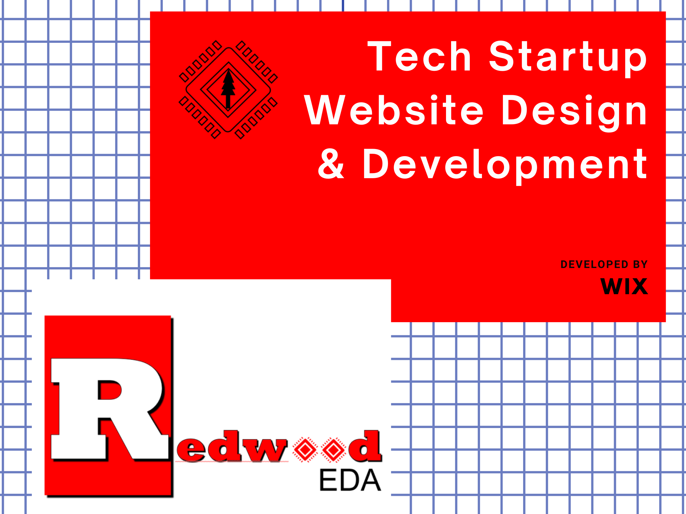
View Prototype with InVisionRedWood EDA Website Design
A silicon chip maker startup business that prvides techniques and turotials for revolutionizing the silicon industry with "transaction-level design" capabilities for ASIC FPGA and cloud FPGA design.
Pain Points: It has an existing website with domain. However, it isn't interactive and eye-catching. The content is cluttered and information is outdated.
Challenges: How to promote the new brand? What content should be included? How to make the website more consistent?
Solutions: Use CMS to reorganize the content. Add tutorial videos to provide visual experience for its techniques. Design a new logo and use design system to align its design patterns.
My Tasks: As a team leader, I analyzed existing problems and challenges, drafted to-do-list for the upgrade of the website. I mocked up the wireframe on Adobe XD. I also designed the logo and prototype for the new website. For the next step, I drafted the conceptual map and built the website on Wix. I kept the core products and services sections, and I also add the education and contact sections to make the website more interactive with its users.
Before & After
Duration: 2 months
Methods: Interviews, Wireframe, Prototyping
Tools: Adobe Photoshop, XD, Illustrator, Wix
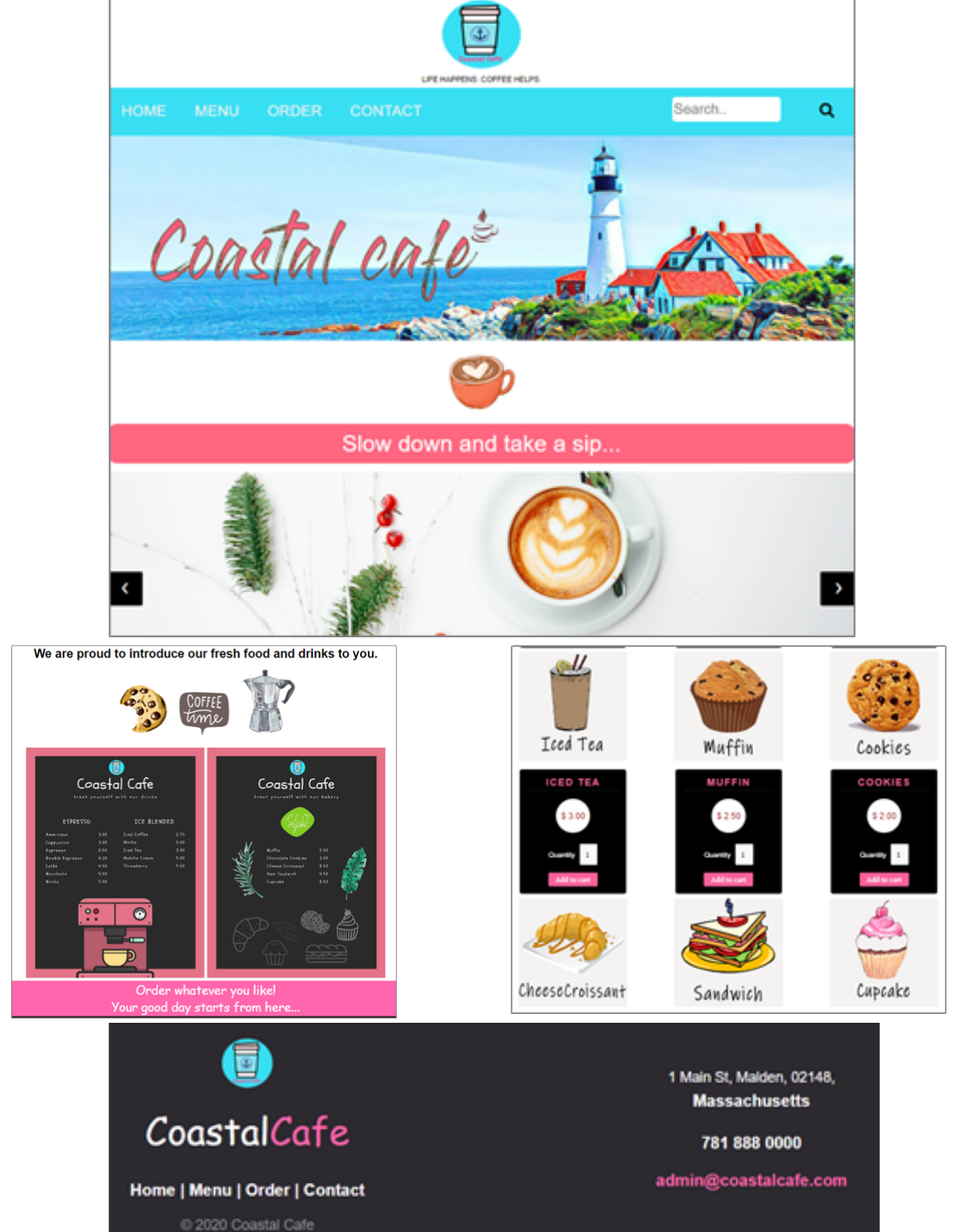
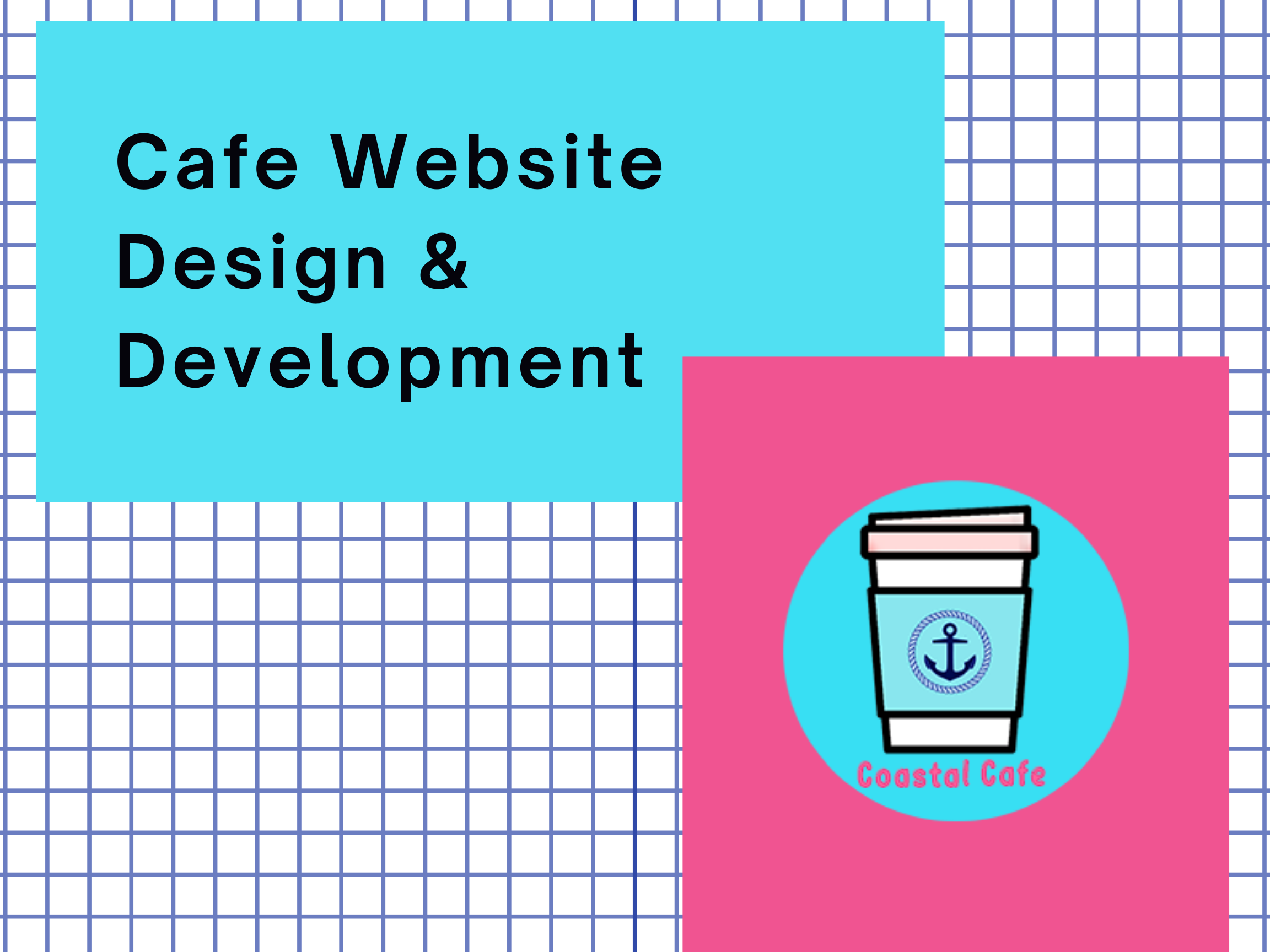
Visit SiteCoastal Cafe Website Design & Development
A business transition proposal for the local small physical store to run online business during the pandemic.
In this project, I designed and developed a responsive website for Coastal Cafe. The overall color palette is coastal style. The wireframes were scratched on XD. I designed the logo and banner on Photoshop. Part of the images were taken by me. The menus were designed on Canva. All the codes were created from scratch on Visual Studio Code. I used phpMyAdmin to manage the database.
Website Screenshots
Duration: 1 months
Methods: Market Analysis, Competitive Research, Wireframe, Prototyping
Tools: Google Analytics, Adobe Photoshop, XD, Canva, VS Code, MySQL
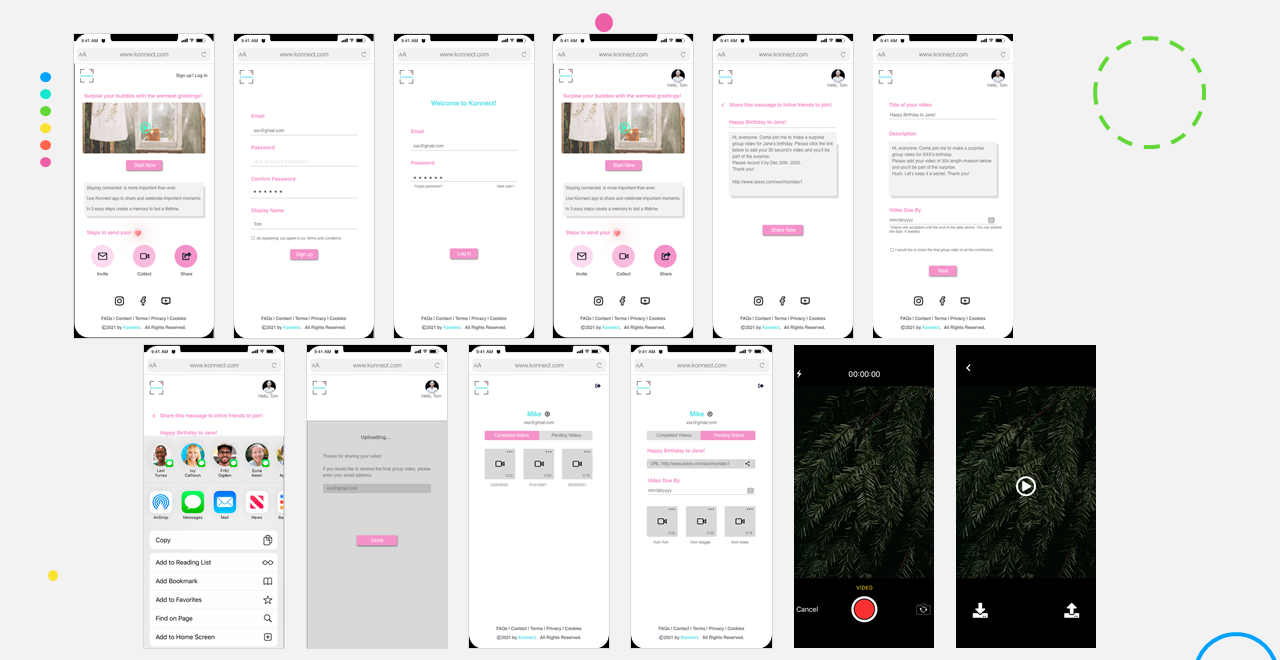
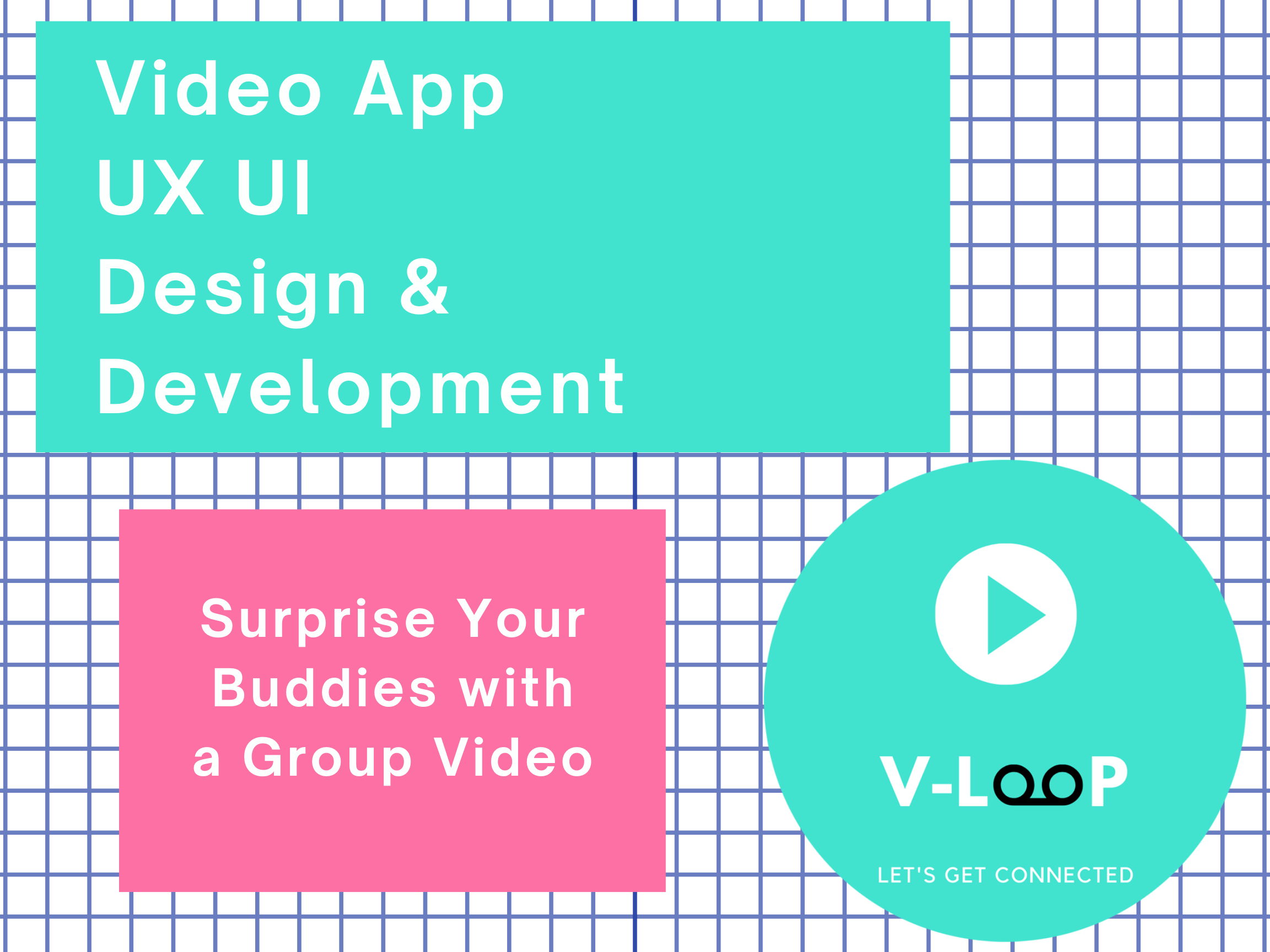
Visit SiteV-loop App Design & Development
A web-based video sharing app that allows users to record individual video and get stitched with your friend's together as a group video to share with your family and friends.
I did the competative research and mocked up the prototypes in Sketch and Figma with iterations after several rounds of brainstorming and interviews with the spnosor and end users. I also commpleted writing the codes for front-end, including the back-end web server and database parts. Next step, I'll work with the back-end developer to apply the video API to it.
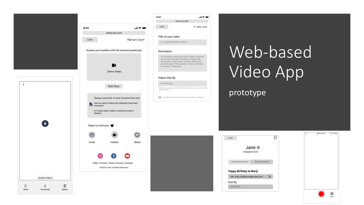
Mockups
Duration: 1 month
Methods: Competative Research, Interviews, Usability Tests, Mockup, Web Development, Cloud
Tools: Adobe Illustrator, Sketch, Figma, VS Code, MySQL, AWS
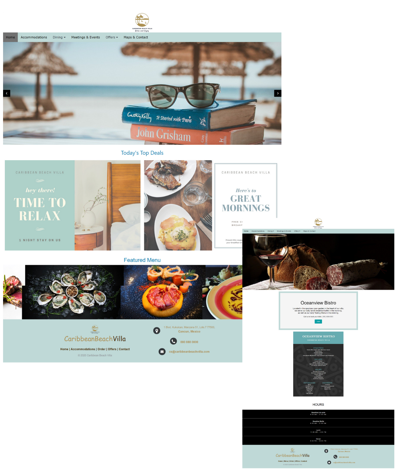
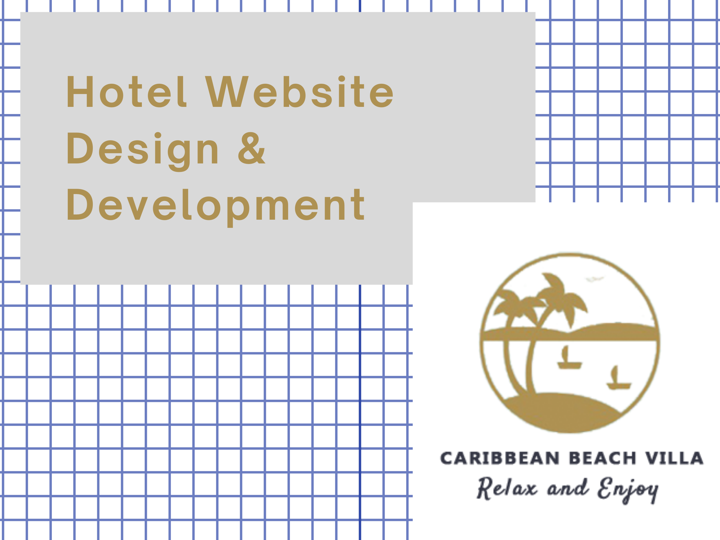
View Prototype with FigmaCaribbean Beach Villa Website Design & Development
A local hotel website that provides a great getaway place when post-pandemic. It provides online room reservation and catering order services.
I mocked up the website from scratch during the pandemic, aiming to provide some ideas for local small business to swtich from traditonal brick-and-mortar mode to e-commerce mode.
Website Screenshots
Duration: 2 months
Methods: Competative Analysis, Card Sorting, Wireframes, Prototyping, Web Development
Tools: Adobe XD, Optimal Workshop, UserTesting, VS Code, phpMyAdmin, MySQL
By the end of the project, I have collected insights and feedbacks from different groups and turned all findings into the prototype that meets WTC Atlanta's design guidelines. and got their recognition for the work.
Visit Site
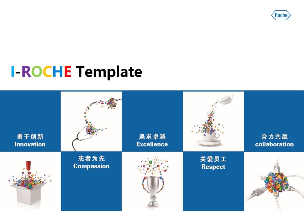
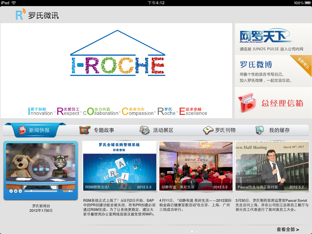
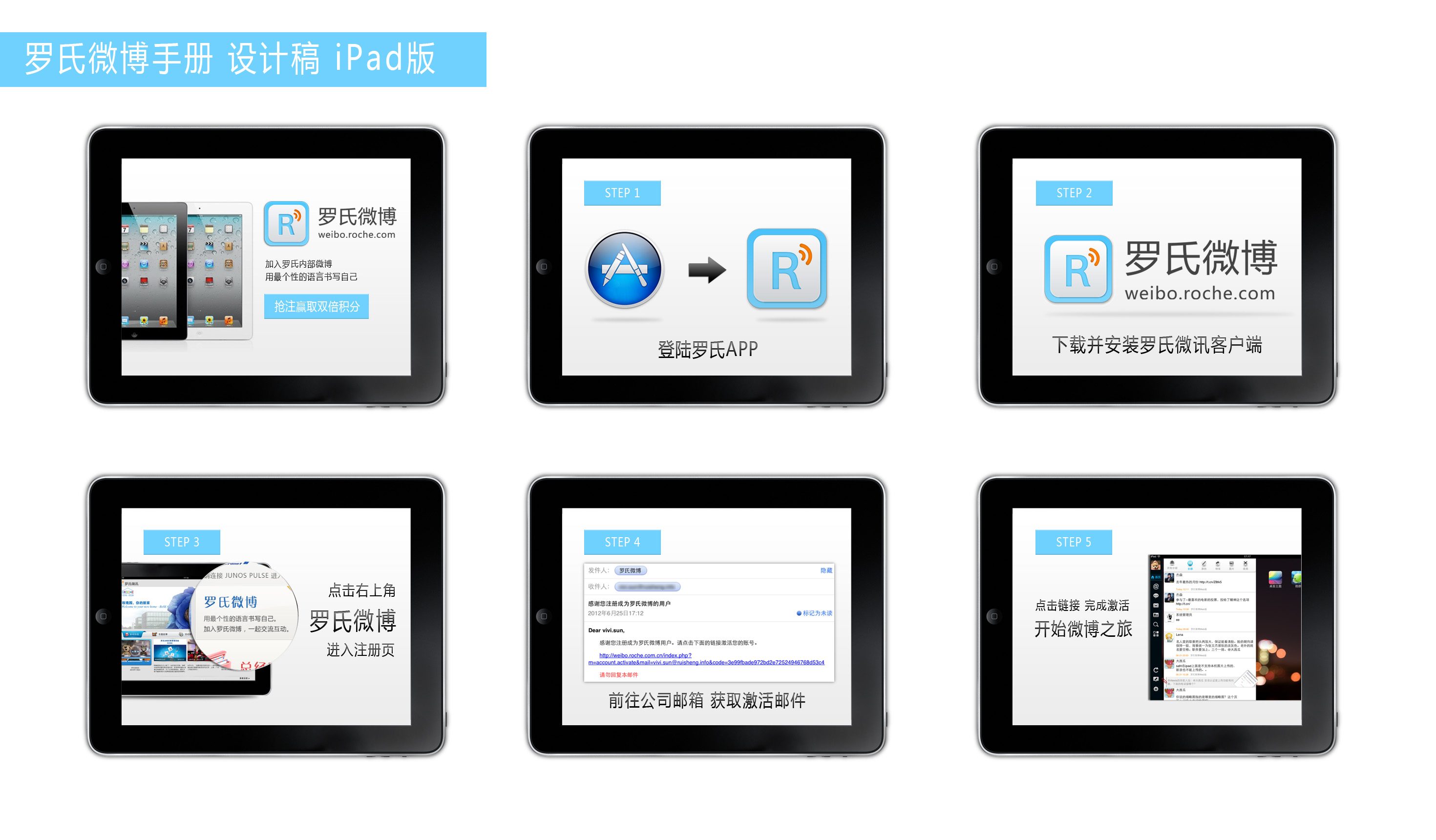
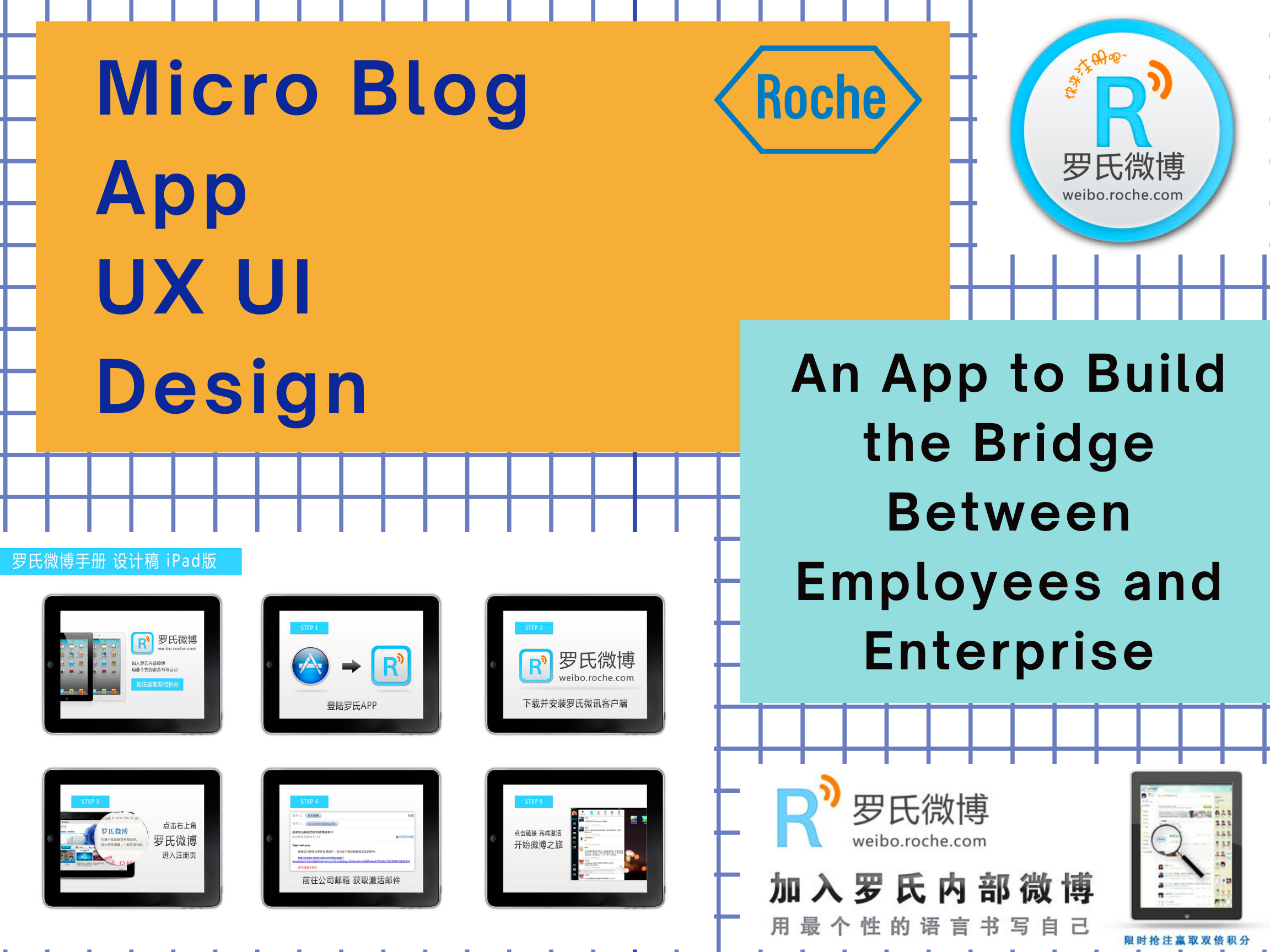
Roche Micro Blog App Design
A twitter-like mobile app designed to engage employees to communicate and participate in trending corporate events.
I did user interviews with stakeholders and users to define the business goals and user goals. Based on research analysis, I created personas, sketched task flow and journey mapping, and mocked up the app from scratch.
Design Pattern
App UI Design
Duration: 6 months
Methods: Qualitative Research, User Interview, Persona, Journey Mapping, Prototyping, Testing
Tools: Adobe Illustrator, XD, Keynote
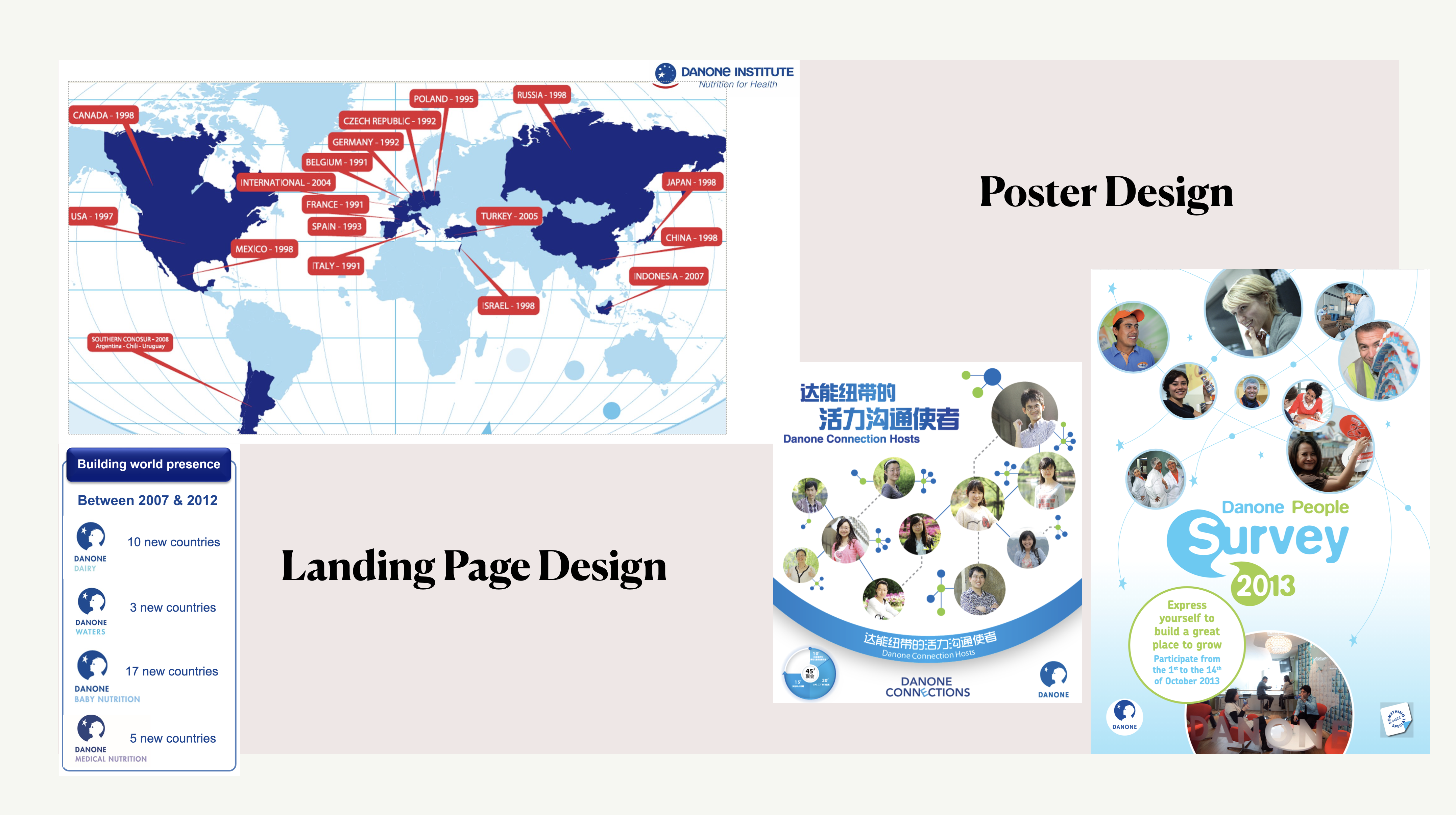
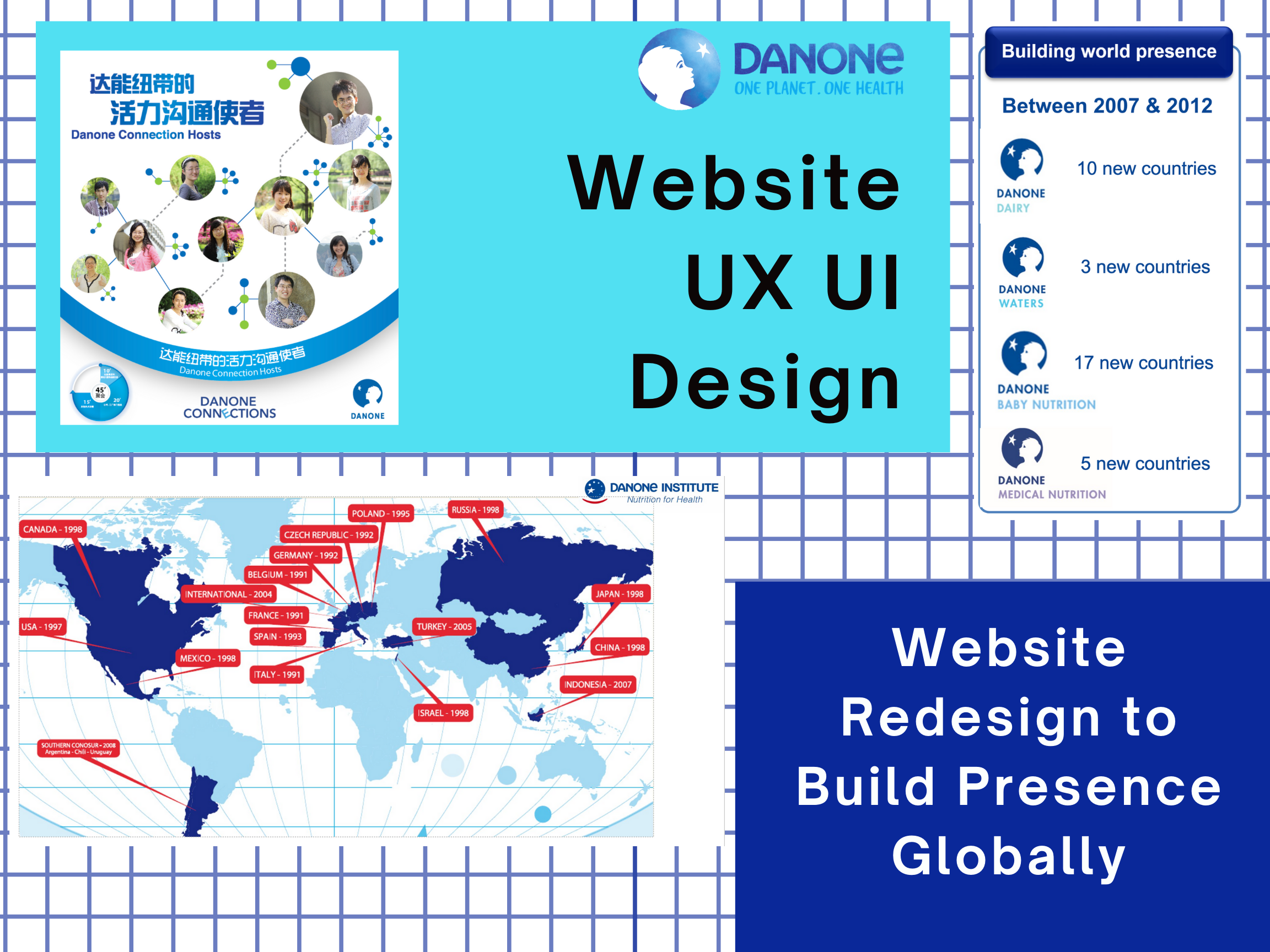
Danone Website Design
Featured website update focusing on corporate ad-hoc events such as annual employee survey, quarterly seminar, etc.
I interviewed with different stakeholders and users to define the features, objectives and theme. By qualitative and quantitative research methods, we aligned the context and diagramed user insights into wireframes and mockups. I also deisgned the posters and banners featuring different topics.
UI Design
Duration: 6 months
Methods: User Research, Wireframes, Prototyping, Graphic Design
Tools: Photoshop, Illustrator, XD, Keynote
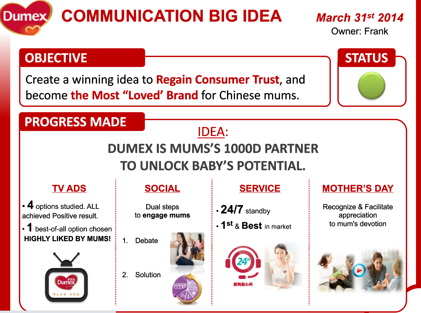
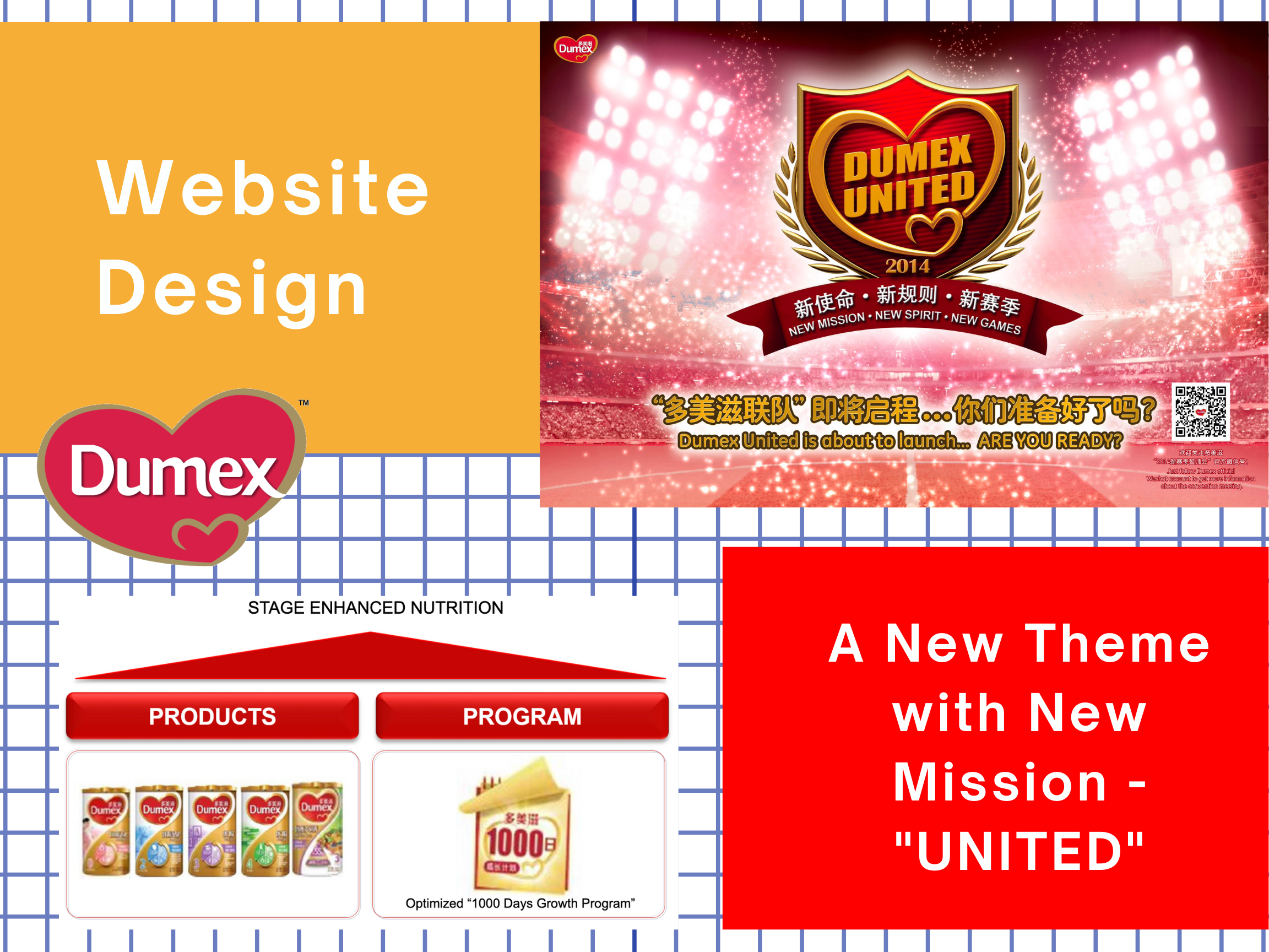
Dumex Website Design
Website redesign following corporate's new vision and mission.
After interviewed with stakeholders and end users, I collected the pain points and insights to brainstorm with team. Once we aligned the story mapping, I sketched the wireframes and did iterations after secondary interviews. Besides the high-fidelity mockups, I also deisgned relevant icons, banners and posters for the communication template.
Dumex Template
Duration: 6 months
Methods: Competitive Analysis, User Interview, Story Mapping, Prototyping, Graphic Design
Tools: Survey Monkey, Adobe XD, Illustrator
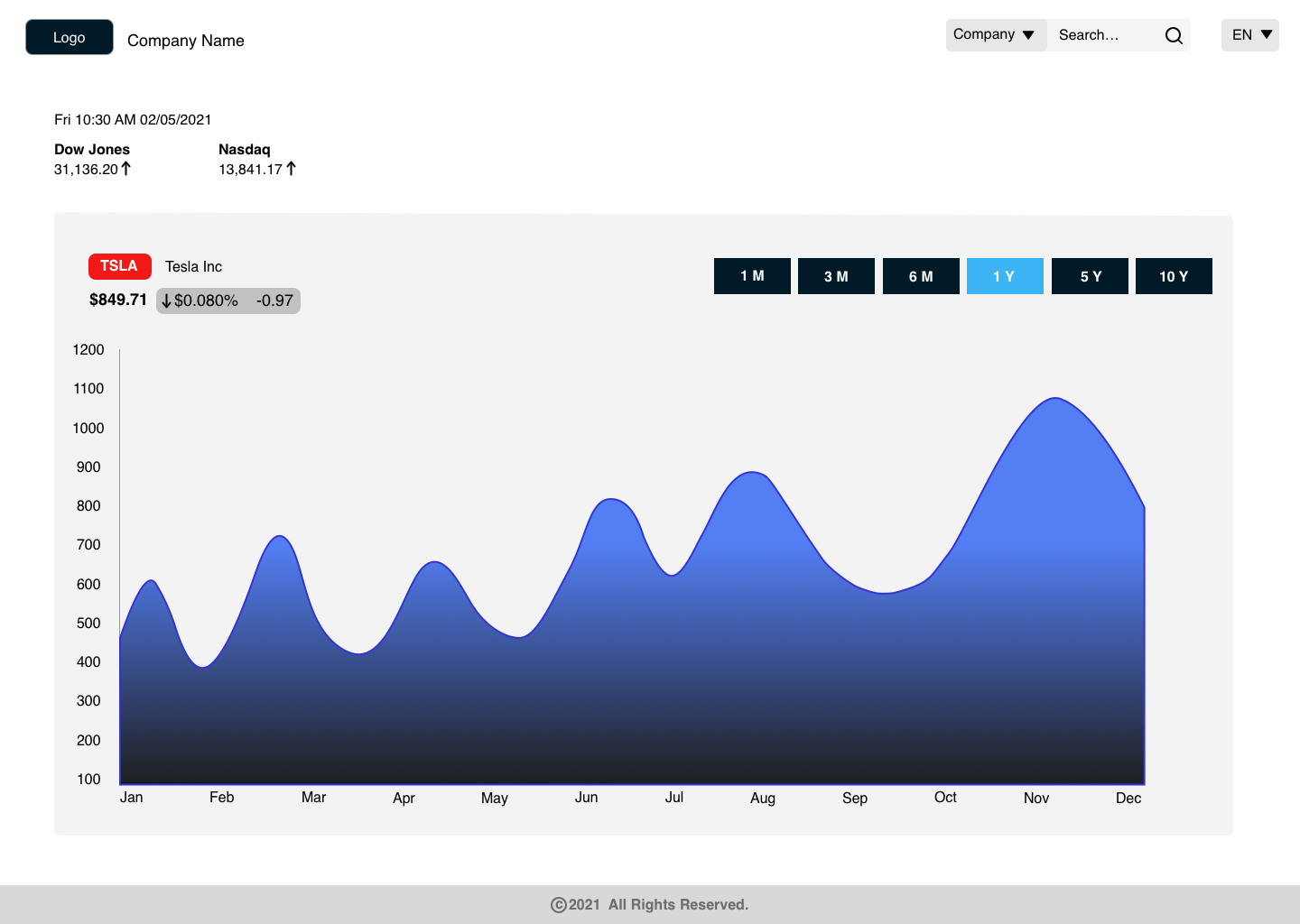
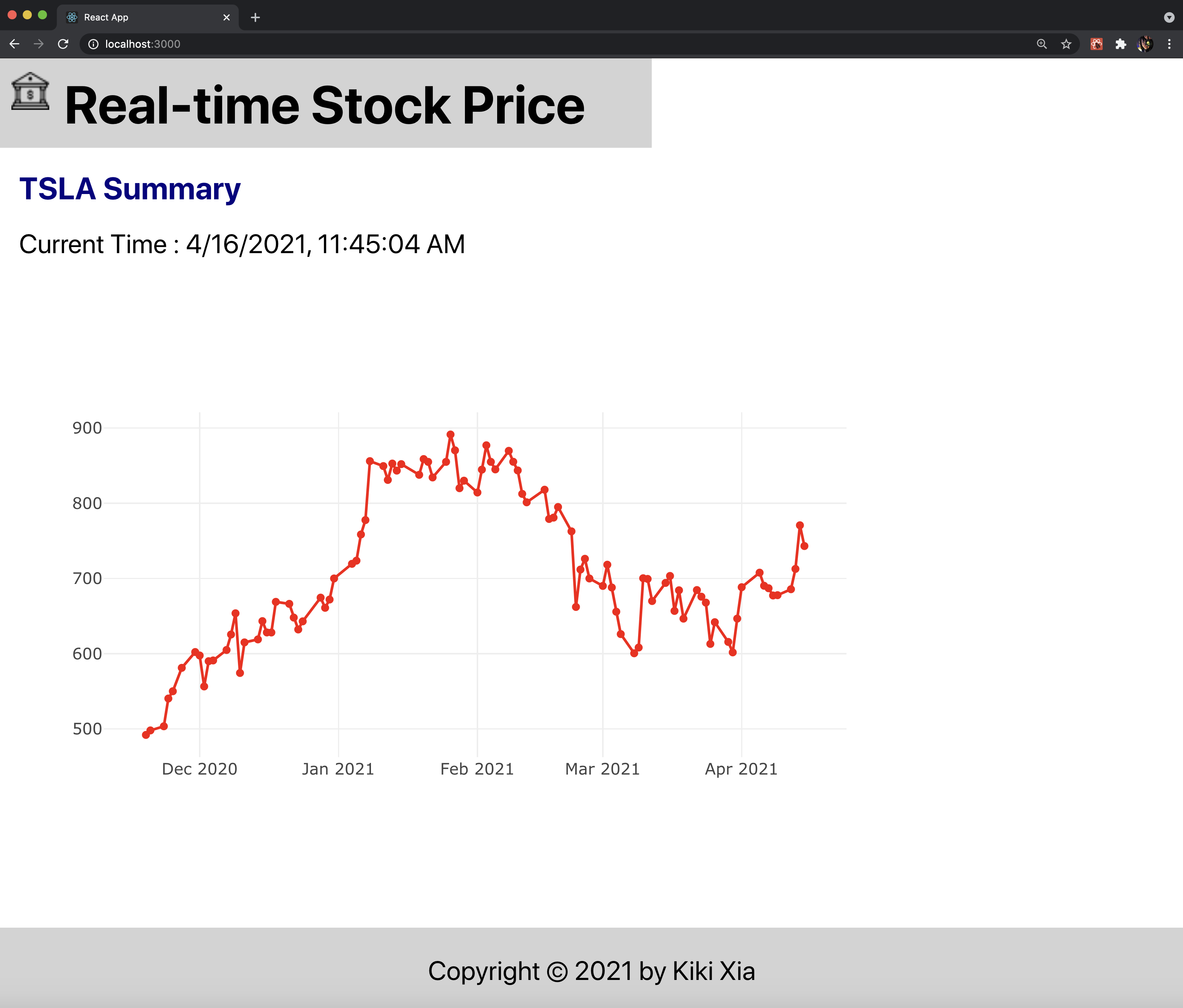
React Stock Website Design & Development
Real-time stock price website built with React.js
I applied Alpha Vantage API to get the real-time stock price for this website. Users can download the plot, zoom in and zoom out to compare the index by date and month.
Mockup
Website Preview
Duration: 2 months
Methods: Market Research, Prototyping, Testing, Front-end Development
Tools: Illustrator, Sketch, VS Code
View Code on Github